Graphic design plays a pivotal role in launching a new restaurant or refreshing an existing brand by visually communicating the essence of the establishment and creating a memorable experience for customers. When approached by a real estate developer looking to throw their hat into the hospitality business, I provided a design exploratory to visually kick-off the intended projects. It can be a structural vision they want rendered, a new brand launch or a just a refresh to an existing logo.
Case 1 - Structural Rendering
Developers have money and a vision. By creating a rendering of what that looks like will jump start the projects into the next phase of development.
LOGO OPTIONS
By providing logo designs and graphic design elements to build on, the project progresses.
case two | DAKOTA BLUE
BRIEF: This will be a new build out of a high end tap house eatery. The decor aesthetic will feature natural elements in an outside-inside interior design. “Dakota” and “Blue” were the names of two dogs the developer owned at one time.
The exploratory intends to help solidify the client’s vision and direct the branding process from the start. A mood board is developed from the initial brainstorm visuals and suggests more directions to enhance planning.
word bank from initial ideation
Word banks provide touch points of emotion and messaging needed to express how the brand will be developed as the design kick-off begins. These words define the overall brand vibe the client is trying to convey. The desire was for this location placing emphasis on lingering in the environment and enjoying more than just food and drink. The words reflect how design will be treated for logo and menu design, interior and exterior treatment as well as the menu itself and how it is served.
Color research
Research supports direction with Trend Forecast information for colors and textures
brand vision | logo exploration
Until the client fully knows the visual aesthetic of their brand, the logo exploratory is only a quick set of options to launch from. In addition to a color scheme, I suggest typography and graphics that show varying styles of communication. The right tonality will resonate with the client’s vision.
case three | the pizza legend
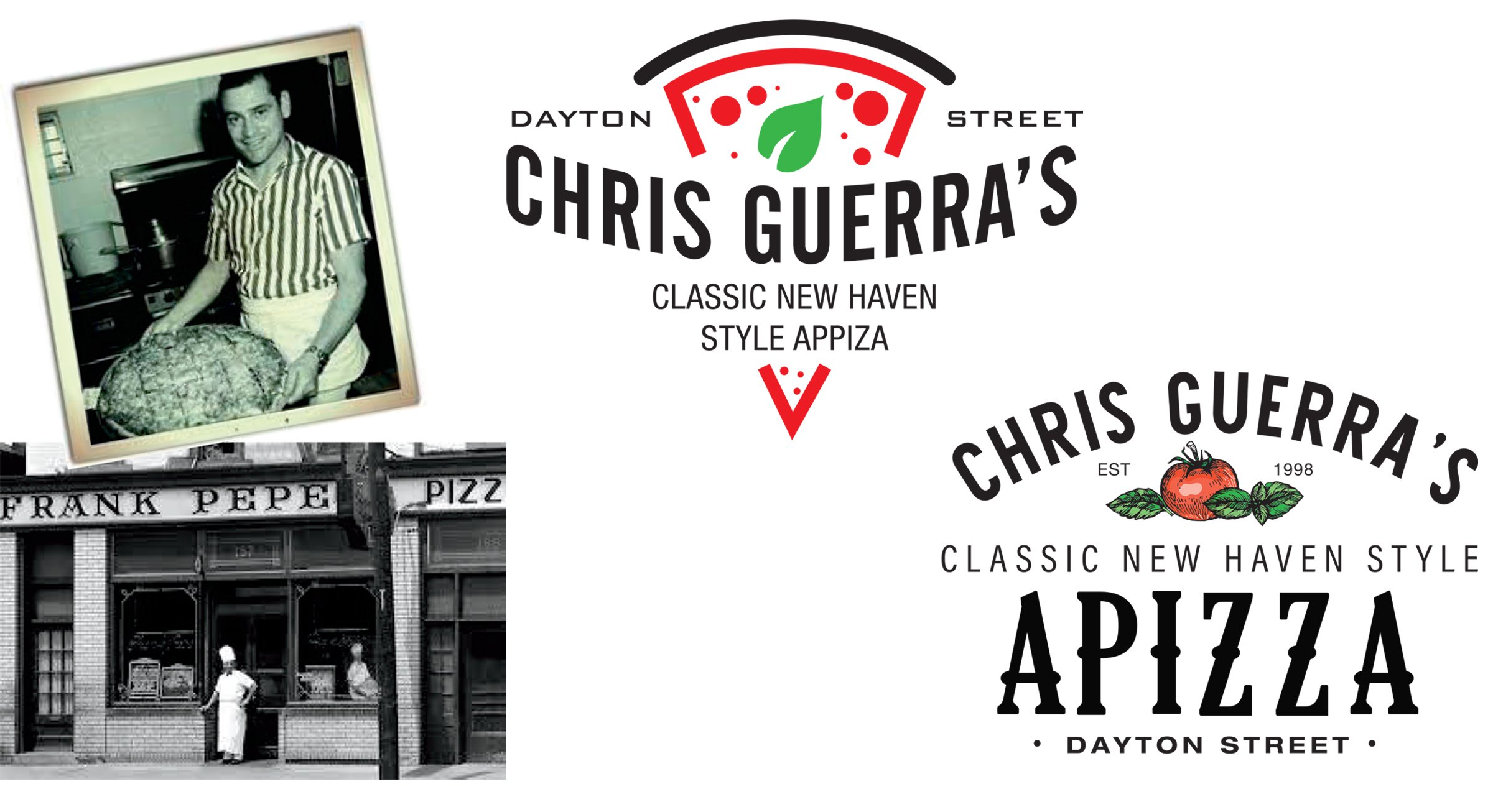
BRIEF: The daughter of a reknowned pizza restaurant wanted to rebrand themselves. While previously named for their location, they wanted the refreshed brand to celebrate their famed owner and patriarch.
How this restaurant evolves its brand to live in the hearts and minds of those who understand the sheer awesomeness of New Haven, Connecticut’s pizza landscape was given considerable consideration.
Generating options with differing typography and graphics can define a direction the client prefers before developing the logo further
case four | THE LITTLE LIME
A brand refresh for a small take-out Mexican eatery. The emphasis is on serving fresh ingredients and lighter, more organic options. Not only a refresh, I renamed the business to reflect the crisp & cool taste aesthetic put forth in the new menu.


